The wide array of information technology trends has been closely examined by a number of noted technologists. Chief among them is Ray Kurzweil, a highly accomplished inventor, futurist and author (see Ray Kurzweil Biography). In 2012, Kurzweil became the Director of Engineering at Google, heading up a team developing machine intelligence and natural language understanding (i.e. applications you can talk to in a conversational way).
About technology advancement, Kurzweil says, “. . . if a technology is an information technology, the basic measures of price/performance and capacity (per unit of time or cost, or other resource) follow amazingly precise exponential trajectories.”
This is a critically important discovery as relates to electronic physical security systems, because today’s security systems are built using information technologies, and tomorrow’s systems will be as well. This article provides the proof that security systems technology is about to enter a period of radical change: The Increasing Pace of Technology Advancement.
The illustrations below provide a closer examination of the individual trends that are summarized that article.
Don’t Get Fooled by Technology Progress Graphs
The graphs I presented in my article, and most of the graphs presented below, show some pretty amazing trajectories for technology advancement. How is it that this data has been around for many years, and we haven’t really been aware of it?
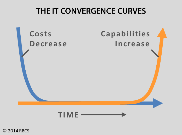
One of the reasons is that exponential curves are not usually shown in their dramatic form, in the shape that visually represents the impact that technology advancement will have on us. The dramatic forms of the curves look like the two curves in the image below, which depict the two megatrends that apply to all information technology advances.
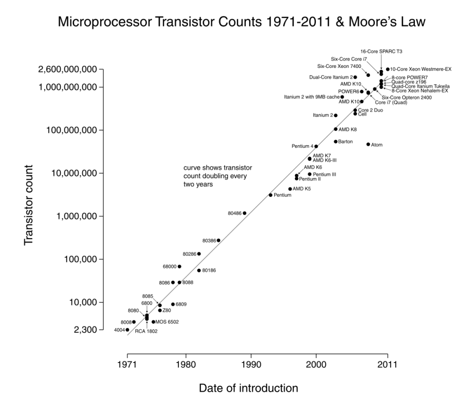
Instead, most of the time IT trends are shown in a graph whose scale is not a linear scale (progresses in same-size steps) but in a logarithmic scale (each step is many times the size of the previous step), which is also called an exponential graph. The Wikipedia graph below of Microprocessor (CPU) Transistor Counts is a logarithmic scale graph, which always results in a technology trend appearing as a straight line at about a 45° angle.
Wikipedia's Exponential Graph of Moore’s Law
This is How We Get Fooled
Note that the graph trend is a straight line, which visually says to the common eye, “this is a nice, steady, predictable progression.” Only if you examine the graph VERY CLOSELY, do you see that the scale on the left hand side of the graph IS NOT a steady progression. It is an exponential progression. Each line on the scale is one more “10 x 10” factor. The progression is:
- 10,000 (ten thousand – 104, also expressed as 10 x 10 x 10 x 10 or “10 to the 4th power”)
- 100,000 (one hundred thousand – 105)
- 1,000,000 (one million – 106)
- 10,000,000 (ten million – 107)
- 100,000,000 (one hundred million – 108)
- 1,000,000,000 (one billion – 109)
The “power” is also called an “exponent”, which is why the sequence of numbers is called an exponential progression, and why a graph made using that progression is called an exponential graph.
The visual image of an exponential graph is how we get fooled.
When we look at the list of numbers above, the numbers seems to make a nice even progression, because the number of zeroes at each step increase by one, and the exponents (the X number in the “10x” expressions) also increase by one. The graph’s trend line visually presents a steady incremental increase—which of course is visually wrong—because the scale on the left is 10 times more at each step.
However, graph below shows what the same data looks like when presented in the kind of graph that matches everyday thinking—a linear (or same-size step) graph. This shows a completely different picture!
Wikipedia's Linear Graph of Moore’s Law

One benefit of the exponential (straight-line) graph is that it enables prediction of the amount of technology advancement in future years, as you can see below in Ray Kurzweil’s graph showing the future power of $1,000 computers.
Ray Kurzweil's Graph of the Future Power of $1,000 Computers

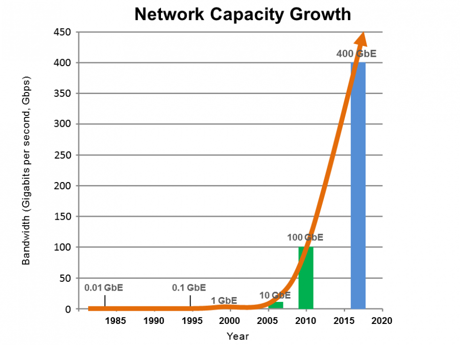
However, for predicting the impact and pace of technology advancement, we need to use linear graphs that show the dramatic curve taking place, as the remaining graphs on this page do.

Megapixel camera resolutions advance first in consumer technology, and then appear in security video cameras.

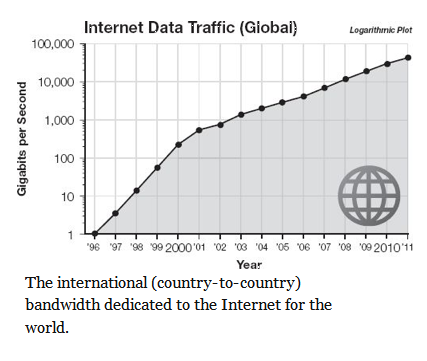
Networking technology growth is expected to reach speeds of 1 Tbps (1 Terabits per second) within the next few years. Here is the development progress so far.
These two graphs are trends impact mobile computing capabilities, as well as the growth of Internet of Things technology.


The next two graphs are trends impacting cloud-based services.